Blue. If you've looked at a computer screen recently, I can almost guarantee that you've seen blue. Somehow, blue has gained the honor of being the highlight color of almost every UI.
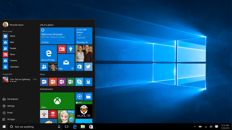
Let's look at some popular UI styles. Windows 10 uses blue extensively. Blue is their brand color. Blue is the default color for the app tiles. Blue is the color of Edge. Blue is everywhere:
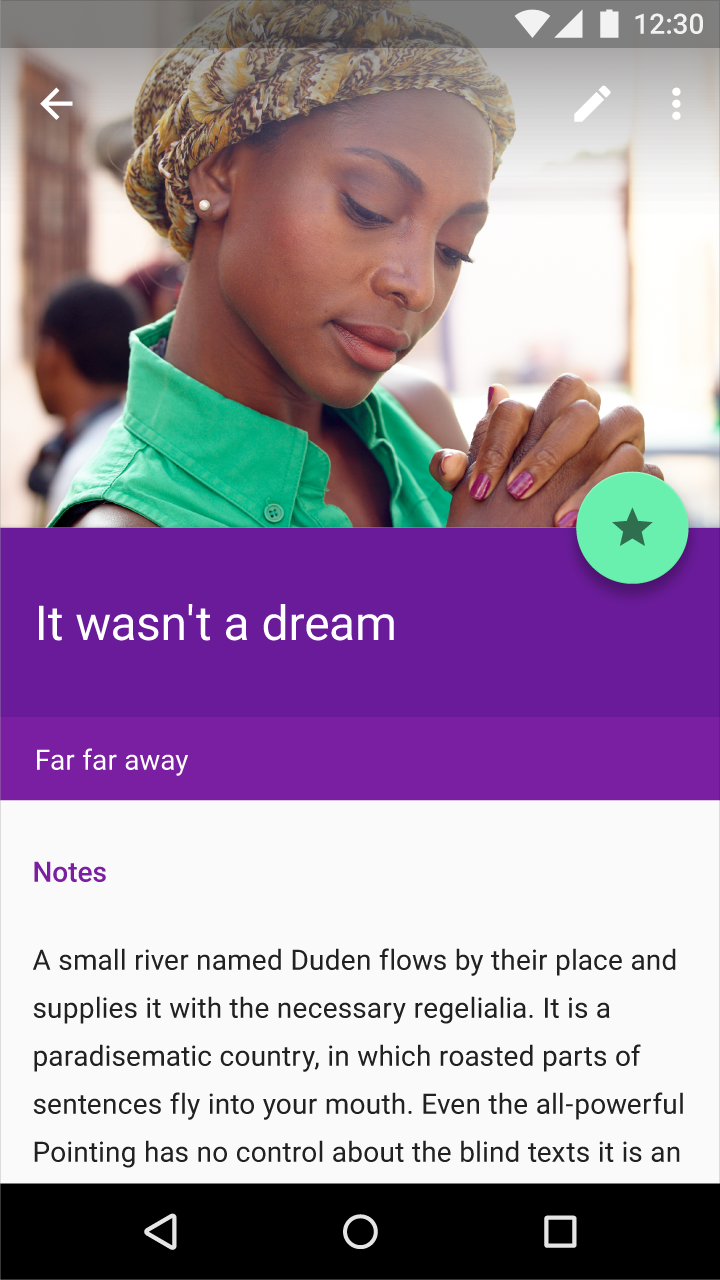
MacOS is part of the sea of blue too! Blue is the color of check boxes and buttons. Blue is a highlight in apps as well; the title of a note or the color of the user's location:

Blue extends further than Mac and Windows. When you highlight text on any platform, the text is blue. When there is an emphasised button, it is probably blue. Blue is the highlight color everywhere; Windows, Mac, "Holo" Androids, GNOME, iOS, and many more.
To some, blue is meaningful. The film industry just can't stop making the screens of our future more blue. In film, blue symbolises digital technology, as it is a color uncommon in nature.
But to me, blue is meaningless. Blue is simply a highlight, a reflection of the computer I am using. Blue is a lost opportunity.
And some have recognised this. One noticeably non-blue UI style is Google's Material Design. When using material design, the highlight color is not a constant, system-wide color. The highlight color represents something - it represents the brand of the application. It creates an identity; Gmail is red, Inbox is blue, Keep is yellow and Sheets is green. Finally, the highlight color brings some meaning to the UI:
In Sugar, we change the highlight color as well. Unlike material design, we do not represent the brand identity; many Sugar activities do not have a strong brand anyway. Instead, we use the highlight color to represent ownership. Every user has a set of colors they "own", and when they see something with their colors, that indicates they own that thing. We use this in the journal - the color of an activity's icon is the creator's color.
I don't know if Sugar's use of color is smart, or if Material Design's use of color is effective. That's a question I'd love to hear answered. But every time I think about their use of color, I feel just a little bit happier. At least they are not like the other platforms, which seem to miss the huge opportunity that using a non-blue highlight color would be.
I hope you enjoyed this article. Contact me if you have any thoughts or questions.
© 2015—2025 Sam Parkinson