A core part of Sugar's design is the palette system. Palettes bring together the idea of a tooltip and a right-click menu. When a palette is show, it first has the "primary popdown", where the tooltip part of the palette is shown:
Users find it easy to discover the primary popdown. From my user testing, when a user is confused they just keep their mouse still. This is great - it shows how intuitive the primary popdown system is.
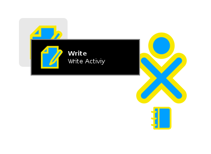
However, there is also the "secondary popdown". This is where the menu of actions is shown. This is often helpful to users. For example, seeing the "Start New" action on the "Write Activity" palette makes intuitive sense to users - more so than clicking the icon does.
However the secondary popdown is fiddly. The user must keep their mouse over the button the palette is connected to (for example, the activity icon in the home view). Often, new users don't do this; they move their mouse over the palette as soon as the primary popdown shows.
Proposal
Unify the primary and secondary popdowns. The timing would be the same as the primary popdown, however the whole palette would be shown rather than just the primary section.
This may make more sense to users, as they don't have to keep their mouse over the button. It would also aid users, as they don't have to wait as long or move their fingers to the right click button.
One thing to test is if this change is annoying to users; if they experience too many palettes showing up. I don't think that this will happen; if this was an issue it would probably also be an issue for the primary popdowns too. However, testing is the imperative in this situation; there is no point in making a usability change without testing it!
I hope you enjoyed this article. Contact me if you have any thoughts or questions.
© 2015—2024 Sam Parkinson